tl;dr
My team and I have been using graphviz and git to perform project management tasks.
It has numerous benefits, including:
- Asynchronous project updates (ie fewer meetings)
- Improved updates for users
- Visualisation of complexity of project for stakeholders and team
- Assumptions challenged. Progress can be measured using git itself (eg log)
Background
Recently I’ve had to take on some project management tasks, managing engineering for a relatively large-scale project in a large enterprise covering a wide variety of use cases and demands.
One of the biggest challenges was how to express the dependencies that needed to be overcome to get the business outcomes the stakeholders wanted. Cries of ‘we just want x’ were answered by me with varying degrees of quality repeatedly, and generally left the stakeholders unsatisfied.
Being a software engineer – and not a project manager – by background or training, I naturally used graphviz instead to create dependency diagrams, and git to manage them.
The examples here are in source here and I welcome PRs and are based on the ‘project’ of preparing for a holiday.
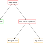
Simple
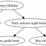
We start with a simple graph with a couple of dependencies:
digraph G {
 "Enjoy Holiday" -> "Book tickets"
 "Enjoy Holiday" -> "Pack suitcase night before"
 "Pack suitcase night before" -> "Buy guide book"
 "Pack suitcase night before" -> "Buy electric converter"
}
The emboldening is mine for illustration; the file is plain text.
This file can be saved as simple.gv (.gv is for ‘graphviz’) and will generate this graph as a .png if you run dot -Tpng simple.gv > simple.png:
Looking closer at simple.gv:
digraph – Tells graphviz that this is a directed graph, ie the relationships have a direction, indicated by the -> arrows. The arrow can be read as ‘depends on’.
Enjoy Holiday is the name of a node. Whenever this node is referenced in future it is the ‘same’ node. In the case of Pack suitcase the night before you can see that two nodes depend on it, and it depends on one. These relationships are expressed through the arrows in the file.
The dot program is part of the graphviz package. Other commands include neato, circo and others. Check man dot to read more about them.
This shows how easy it is to create a simple graph from a text file easily stored in git.
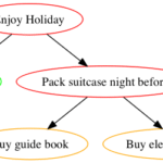
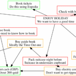
Layouts
That top-down layout can be a bit restrictive to some eyes. If so, you can change the layout by using another command in the graphviz package. For example, running neato -Tpng simple.gv > simple.png produces this graph:

Note how:
- Enjoy holiday is now nearer the ‘centre’ of the graph
- The nodes are overlapping (we’ll deal with this later)
- The arrows have shortened (we’ll deal with this later too)
If you’re fussy about your diagrams you can spend a lot of time fiddling with them like this, so it’s useful to get a feel for what the different commands do.
If you like this post, you might like my books Learn Git the Hard Way, Learn Bash the Hard Way or Docker in Practice


Get 39% off Docker in Practice with the code: 39miell2
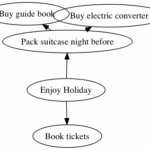
Colours
We can get more project information into a node by colorizing the nodes. I do this with a simple scheme of:
- green = done
- orange = in progress
- red = not started
Here’s an updated .gv file:
digraph G {
 "EH" [label="Enjoy Holiday",color="red"]
 "BT" [label="Book tickets",color="green"]
 "PSNB" [label="Pack suitcase night before",color="red"]
 "BGB" [label="Buy guide book",color="orange"]
 "BEC" [label="Buy electric converter",color="orange"]

 "EH" -> "BT"
 "EH" -> "PSNB"
 "PSNB" -> "BGB"
 "PSNB" -> "BEC"
}
Running the command
dot -Tpng simple_colors.gv > simple_colors.png
on this results in this graph:

Two things have changed here. Referring to the full description of the node can get tiresome, so ‘Enjoy holiday’ has been referenced with ‘EH’, and associated with a ‘label’, and ‘color’.
"EH" [label="Enjoy Holiday",color="red"]
The nodes are defined in this way at the top, and then referred to with their relationships at the end. All sorts of attributes are available.
Nodes
Similarly, you can change the attributes of nodes in the graph, and their relationships in code.
I find that with a complex graph with some text in each node, a rectangular node makes for better layouts. Also, I like to specify the distance between nodes, and prevent them from overlapping (two ‘problems’ we saw before).
digraph G {
 ranksep=2.0
 nodesep=2.0
 overlap="false"

 node [color="black", shape="rectangle"]

 "EH" [label="Enjoy Holiday",color="red"]
 "BT" [label="Book tickets",color="green"]
 "PSNB" [label="Pack suitcase night before",color="red"]
 "BGB" [label="Buy guide book",color="orange"]
 "BEC" [label="Buy electric converter",color="orange"]

 "EH" -> "BT"
 "EH" -> "PSNB"
 "PSNB" -> "BGB"
 "PSNB" -> "BEC"
}
By adding the ranksep and nodesep attributes, we can influence the layout of the graph by specifying the distance between nodes in their rank in the hierarchy, and separation between them. Similarly, overlap prevents the problem we saw earlier with overlapping nodes.
The node line specifies the characteristics of the nodes – in this case rectangular and black by default.
Running the same dot command as above results in this graph:

which is arguably uglier than previous ones, but these changes help us as the graphs become more complex.
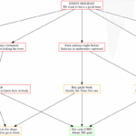
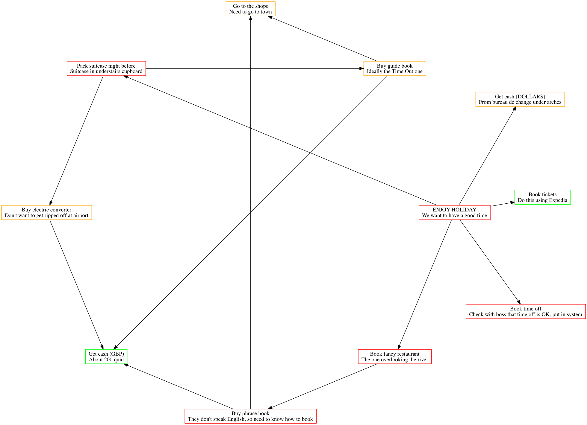
More Complex Graphs
Compiling this more complex graph with dot:
digraph G {
 ranksep=2.0
 nodesep=2.0
 overlap="false"

 node [color="black", shape="rectangle"]

 "EH" [label="ENJOY HOLIDAY\nWe want to have a good time",color="red"]
 "BTOW" [label="Book time off\nCheck with boss that time off is OK, put in system",color="red"]
 "BFR" [label="Book fancy restaurant\nThe one overlooking the river",color="red"]
 "BPB" [label="Buy phrase book\nThey don't speak English, so need to know how to book",color="red"]
 "BT" [label="Book tickets\nDo this using Expedia",color="green"]
 "PSNB" [label="Pack suitcase night before\nSuitcase in understairs cupboard",color="red"]
 "BGB" [label="Buy guide book\nIdeally the Time Out one",color="orange"]
 "BEC" [label="Buy electric converter\nDon't want to get ripped off at airport",color="orange"]
 "GTS" [label="Go to the shops\nNeed to go to town",color="orange"]
 "GCG" [label="Get cash (GBP)\nAbout 200 quid",color="green"]
 "GCD" [label="Get cash (DOLLARS)\nFrom bureau de change under arches",color="orange"]

 "EH" -> "BT"
 "EH" -> "BFR"
 "EH" -> "BTOW"
 "BFR" -> "BPB"
 "BPB" -> "GTS"
 "BPB" -> "GCG"
 "EH" -> "PSNB"
 "EH" -> "GCD"
 "PSNB" -> "BGB"
 "BGB" -> "GTS"
 "PSNB" -> "BEC"
 "BGB" -> "GCG"
 "BEC" -> "GCG"
}
gives this graph:

And with neato:

You can see the graphs look quite different depending on which layout engine/binary you use. Some may suit your purpose better than others.
Project Planning with PRs
Now that you have a feel for graphing as code, you can check these into git and share them with your team. In our team, each node represents a JIRA ticket, and shows its ID and summary.
A big benefit of this is that project updates can be asynchronous. Like many people, I work with engineers across the world, and their ability to communicate updates by this method reduces communication friction considerably.
For example, the other day we had a graph representing our next phase of work that was looking too heavy for one sprint. Rather than calling a meeting and go over each line item, I just asked him to update the graph file and raise a PR for me to review.
We then workshopped the changes over the PR, and only discussed a couple of points over the phone. Fewer meetings, and more content-rich discussions.
Surface Assumptions
Beyond fewer and more effective meetings, another benefit is the objective recording of assumptions within the team. Surprisingly often, I have discovered hidden dependencies through this method that had either not been fully understood or discussed.
It’s also surfaced further items of work required to reach the solution, which has resulted in more and more clear tickets being raised that relate to the target solution. The discipline of coding these up helps force these into the open.
Happier Stakeholders
While inside the team, the understanding of what needs to happen is clearer, stakeholders clamouring for updates are clearer on what’s blocking the outcomes they want.
Another benefit is an increased confidence in the process. There’s a document that’s readily comprehensible they can dig into if they want to find out more. But the fact that there’s a transparent graph of dependencies usually suffices to persuade people that things are under control.
Alternate Views
Finally, here are some alternate views of the same graph. We’ve already seen dot and neato. Here are the others. I’m not going to explain them technically as I’ve read the man page definitions and am none the wiser. They use words like ‘outerplanar’ and ‘force-directed’. Graph rendering is a complicated affair.
circo
fdp

twopi

patchwork

Code
Is here.
If you know more than me about graphviz and have any improvements/interesting tweaks/suggestions then please contribute.
If you like this post, you might like my books Learn Git the Hard Way, Learn Bash the Hard Way or Docker in Practice
Get 39% off Docker in Practice with the code: 39miell2
Neat!
I think you should reverse the direction of your edges (your arrows). When I started https://github.com/purpleidea/mgmt/ we put them in the direction I’m mentioning because it was more clear. Arrows are like time. You’ve got them listing their dependencies. It’s backwards.
Thinking in terms of dependencies is how most modern build tools work internally, as well as how they choose to visualize their own tasks.
For example, in Gradle, tasks are graphed with arrows pointing to dependencies: https://docs.gradle.org/current/userguide/java_plugin.html#N16A02. The same is true for Go’s dependency graphs (https://github.com/golang/dep/blob/master/docs/img/StatusGraph.png), Ninja’s GraphViz, etc.
I realize this is an uncommon choice in management tools, but I think given the intended audience of software developers (and the tooling), I think this is a natural fit for a visual language given the other tools in the toolbox. Following the arrows for a task naturally enumerates all of its prerequisites. This is something I’ve actually longed for myself in a task management tool, and I’m excited to see a working example here.